In today’s digital world, making your website mobile-friendly isn’t just a good idea—it’s absolutely necessary. Research shows that 53% of people will leave a mobile site if it takes more than three seconds to load. Half of users expect a webpage to load in under 2 seconds, and 46% say their biggest frustration when browsing on mobile is waiting for pages to load.
Mobile SEO involves optimizing your website to improve its ranking in search engine results on mobile devices, such as smartphones and tablets, while also enhancing the overall experience for mobile users.
Let’s dive into some key Mobile SEO strategies that will help you optimise your website for mobile users.
- What Is Mobile SEO?
- Why Mobile SEO Matters
- Mobile SEO vs. Desktop SEO
- Best Practices for Mobile SEO
- Design Mobile-Friendly Content
- Implement Responsive Design
- Optimizing Title Tags and Meta Descriptions for Mobile SERPs
- Improve Mobile Site Speed
- How Web Hosting Affects Site Speed
- Web hosting trusted by professionals!
- Optimize Your Technical SEO
- Focus on Accessibility
- Be sure to pay attention to Local SEO
- Leverage Structured Data
- Optimize for Voice Search
- Track Mobile Performance
- Conclusion
What Is Mobile SEO?
Mobile SEO involves tailoring your website for smartphones and tablets to ensure it’s user-friendly, fast, and easy to navigate on smaller screens. Given the rapid growth of mobile internet use, optimising for mobile is critical to maintaining or improving your site’s ranking in search engine results, particularly with the introduction of Google’s mobile-first indexing.

With mobile-first indexing, Google uses the mobile version of a site as the primary version for indexing and ranking. Websites that don’t deliver an optimal mobile experience risk losing traffic and visibility, underscoring the importance of investing in mobile optimization.
Starting July 5 2024, Google will stop indexing websites that aren’t mobile-friendly. If your site isn’t accessible on mobile devices, it won’t be indexed or ranked by Google anymore.
“The largest part of the web is already being crawled like this, and there is no change in crawling for these sites.” However, “after July 5, 2024, we’ll crawl and index these sites with only Googlebot Smartphone.” (Source)
Why Mobile SEO Matters
It’s no secret that mobile traffic is taking over the internet, with over 60% of all online searches now coming from mobile devices. If your website isn’t optimised for mobile, you might be driving away potential visitors and hurting your search engine rankings. Poor user experience signals—like high bounce rates and slow loading times—can have a significant impact on your site’s performance.

Additionally, Google has shifted to mobile-first indexing, meaning that the mobile version of your site is what Google uses to rank your pages. According to Google Search Central, sites that load quickly and are easy to navigate on mobile devices are favoured in search results. So, if your mobile site isn’t up to par, it could also drag down the ranking of your desktop site. Ensuring a seamless mobile experience isn’t just a nice-to-have anymore; it’s essential for any website.
Key benefits of Mobile Optimization
- Mobile traffic comprises the majority of internet usage.
- Enhances user experience, engagement, and conversion rates.
- Impacts search engine visibility due to Google’s mobile-first indexing
Mobile SEO vs. Desktop SEO
Curious about the key differences between SEO for mobile and desktop? Let’s break it down into a few important factors that can make a big impact on your strategy!
Usability: Mobile screens are smaller, which means your design needs to adjust to fit. Your site should be easy to read, simple to navigate with touch, and deliver a fantastic user experience, including quick loading times. After all, no one likes waiting!
Keywords: Did you know that many mobile searches happen on the go? These searches often have local intent and use voice commands. This shift means you’ll want to tailor your keywords to match the unique needs of mobile users.
Search Appearance: Search results look different on mobile devices, and it’s crucial to know how to make your pages shine in that space. A little extra attention here can help you stand out and attract more visitors.
Content Format: Mobile users often prefer short, easily digestible content. Use bullet points, headings, and concise paragraphs to make information quick to read. Visuals like images and videos can also enhance engagement.
Pop-ups and Interstitials: Be cautious with pop-ups, as they can be frustrating for mobile users. Google penalizes sites that use intrusive interstitials that disrupt the user experience on mobile.
Local SEO Optimization: Since many mobile searches are local in nature, it’s essential to optimize your content for local SEO. This includes claiming your Google My Business listing, ensuring your name, address, and phone number (NAP) are consistent across platforms, and using local keywords.
By keeping these differences in mind, you can ensure that mobile users have a smooth experience on your site. Ready to dive in and learn more about optimizing for mobile? Let’s get started!
Best Practices for Mobile SEO
To enhance your site on mobile devices, here are some proven strategies:
Design Mobile-Friendly Content
Crafting content that is easy to consume on smaller screens is key to retaining mobile users. Given that mobile visitors often have limited time and screen space, structure your content for fast readability. Break your text into short paragraphs, use headers to organise sections, and include bullet points for quick reference.
Remember, large blocks of text can overwhelm mobile users. For example, a news article can be structured with short paragraphs and subheadings, making it easier for users to find the information they’re looking for.
You can use a mobile-friendliness test tool like Bing’s to identify issues on your pages. It will highlight problems such as text that’s too small for smaller screens or elements that are too close together for easy touch navigation.
Implement Responsive Design
Responsive web design is essential for modern websites. It allows your site to adapt seamlessly to various screen sizes, providing a smooth experience for users, whether they’re on a smartphone, tablet, or desktop. This method simplifies your workflow, as you won’t need to manage separate versions of your site for different devices. Plus, it enhances your Mobile SEO efforts by consolidating all your traffic to a single URL.
Consider an online retail site: when a customer accesses it on their mobile device, the design automatically tweaks itself. Images resize to fit the screen, and text repositions for easy reading. This responsive setup means users can navigate the site effortlessly without zooming in or out, ultimately leading to a more satisfying shopping experience. In a world where user experience can make or break your online presence, responsive design is not just a luxury; it’s a necessity.
Did you know that over 40% of people say they prefer to complete their shopping on mobile devices, from research all the way to purchase.

Optimizing Title Tags and Meta Descriptions for Mobile SERPs
When you’re optimising for mobile search results, keeping things short and sweet really pays off. Mobile screens can cut off longer titles and descriptions, so it’s best to stick to title tags that are about 50 to 60 characters and meta descriptions around 120-160 characters. This way, users can see your entire message without it getting chopped off.
It’s also super important to ensure that your titles and descriptions genuinely reflect what’s on the page. You want them to be engaging enough to make users want to click through. Remember, a catchy title can make all the difference! Research shows that well-crafted titles can improve your click-through rates and help you rank better in search results.
And don’t forget about Google’s perspective; they stress that having clear and accurate meta descriptions can help users know what to expect from your page. This can lead to a better user experience and keep your bounce rates down. So, putting some thought into making your titles and descriptions concise and appealing is a smart move for Mobile SEO.
Improve Mobile Site Speed
When it comes to mobile websites, fast load times aren’t just a nice-to-have; they’re essential. Google emphasises the importance of speed, and for a good reason—53% of mobile users will leave a page if it takes more than three seconds to load. So, if your site isn’t quick, you could be losing potential customers before they even see what you have to offer.
To speed things up, start by compressing your images. Large files can slow down your site considerably, but tools like TinyPNG or ImageOptim can reduce file sizes while keeping quality intact. Another effective strategy is to minimise JavaScript. This means reducing the amount of code that needs to run when someone visits your site, making it load faster. Consider using asynchronous loading for scripts that aren’t immediately necessary, so they don’t hold up the rest of your content.
Browser caching is another powerful tool in your optimization arsenal. When visitors return to your site, caching allows certain elements to load from their device rather than pulling everything from your server again. This makes for a much snappier experience.
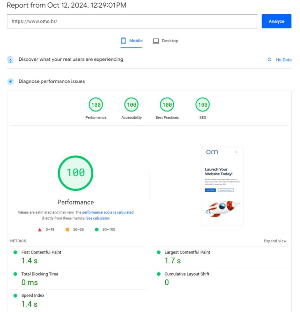
If you’re unsure where to start, Google’s PageSpeed Insights can be a game-changer. This handy tool analyses your site’s speed and gives you tailored recommendations to boost performance. Pay attention to Google’s Core Web Vitals as well, which focus on key metrics like loading speed, interactivity, and visual stability. These factors are crucial for keeping your visitors happy and engaged.
Ultimately, prioritising speed not only enhances user satisfaction but also boosts your chances of ranking higher in search results. Fast-loading sites are more likely to keep visitors around, leading to better engagement and conversions.
Interested in improving your page speed? Get in touch with us to explore the latest optimizations that can boost your site’s performance!
How Web Hosting Affects Site Speed
Your web host is fundamental to your website’s performance, providing the server infrastructure that houses your files and the resources needed to respond to user requests. Many elements contribute to this performance, including server hardware, network connectivity, caching layers, and software configurations.
If you’re using a slower or overloaded shared host, you might encounter longer page load times, delayed responses to user actions, and connectivity issues that come and go. These problems can create a frustrating experience for users, which is especially problematic for sites that drive revenue, as even small delays can lead to lost sales.
Choosing a well-optimised web host can make a significant difference. It allows your site to load pages more quickly, accommodate higher traffic volumes, and provide a reliable and efficient experience for visitors.
Web hosting trusted by professionals!
Unlock the full potential of your website with ScalaHosting. Blazing-fast speeds, top-notch security, and easy-to-use tools.
Optimize Your Technical SEO
To rank effectively, your website needs to be easily crawlable and indexable by search engines, and this is equally important for mobile SEO. Here’s what you should focus on:
- Ensure your site is crawlable.
- Implement SSL/HTTPS to secure your website traffic.
- Use an SEO-friendly URL structure and maintain a clear website hierarchy.
- Properly utilize internal links and resolve any 404 errors.
- Create and submit a sitemap to webmaster tools.
- Optimize your robots.txt file.
- Invest in malware protection and ensure accessibility.
A key point for mobile technical SEO is to avoid blocking Google from accessing your site’s resources. If you do, it becomes challenging for Google to determine if your site is mobile-friendly, which could result in it not being indexed.
Focus on Accessibility
In today’s digital landscape, it’s vital to make mobile websites accessible to everyone, including those with disabilities. Accessibility tools can highlight potential barriers that some users may face when navigating your site. Following guidelines like the Web Content Accessibility Guidelines (WCAG) and the Americans with Disabilities Act (ADA) is important to ensure that all individuals can effectively access your content.
Is Accessibility a Ranking Factor for Search Engines? While accessibility isn’t a direct SEO ranking factor, enhancing your website’s accessibility can often lead to improved SEO performance indirectly.
You can utilise tools such as WAVE and the Accessibility Checker to evaluate how well your website meets accessibility standards.
For in-depth information on ensuring your site is compliant with accessibility requirements, visit W3C’s resource on Web Accessibility: 26 Steps for ADA Website Compliance
Be sure to pay attention to Local SEO
Local SEO is critical for businesses targeting mobile users. Optimising your Google My Business profile can enhance visibility in local search results, making it easier for potential customers to find you.
This includes keeping your contact information up-to-date, managing reviews, and using local keywords in your content. Online reviews play a crucial role in local search. Be sure to encourage customers to leave reviews and respond professionally to all public feedback.
Leverage Structured Data
Using Schema markup is an effective way to improve your site’s visibility in search engine results. This structured data helps search engines understand your content, making it eligible for rich snippets—enhanced search results that are especially beneficial for mobile users who are looking for quick answers.
Search engine results pages (SERPs) now offer more detailed information like product reviews, recipes, and event details directly within the search results. This allows users to access key information without needing to click through to individual websites, making the search experience faster and more convenient.
For instance, a food blog utilising Schema markup can display its recipe in a rich snippet, complete with an image, ratings, and step-by-step instructions. This boosts visibility and increases click-through rates (CTR), especially on mobile, where users are looking for quick and straightforward information.
Not every business needs to implement all schema types on their website. The most beneficial schema markup will depend on your industry and the type of content your site offers, allowing you to focus on what best enhances your brand’s visibility.

Mobile-focused features, such as Accelerated Mobile Pages AMP, are aimed at boosting performance on smartphones and tablets. By stripping web pages down to essential components, AMP allows content to load almost instantly, ensuring a smooth and fast experience for mobile users.
These days, the general agreement is that AMP isn’t really worth the effort. It restricts page functionality, results in similar designs, and tends to keep visitors on Google rather than directing them to your site. So, it’s likely best to pass on it.
Optimize for Voice Search
With the rise of virtual assistants like Siri, Google Assistant, and Alexa, optimising for voice search has become essential. Unlike traditional searches, voice queries are more conversational and often include longer, question-based phrases. Instead of focusing solely on keywords like “best pizza,” it’s more effective to target specific queries like “What’s the best pizza place near me?”
To optimise for voice search, incorporate long-tail keywords and frequently asked questions (FAQs) into your content. This strategy aligns with natural speech patterns and directly addresses user intent.
Utilising tools like Answer the Public can help you discover common questions in your industry, while Google Trends can highlight emerging topics that drive voice searches.
By optimising your content with these strategies, you can enhance visibility in voice search results and better connect with users seeking quick, relevant answers.
The Impact of AI on Voice Search
Artificial intelligence (AI) significantly enhances voice search optimization. AI algorithms, particularly natural language processing (NLP), enable voice assistants to understand context and deliver accurate responses. Google’s BERT (Bidirectional Encoder Representations from Transformers) exemplifies how AI can interpret language nuances, allowing for more relevant search results. As AI continues to evolve, it will improve the accuracy of voice search outcomes, making optimization crucial for businesses.
In addition, local SEO is vital since many voice searches are location-specific. Research shows that 76% of individuals who search for something nearby visit a business within a day.
Track Mobile Performance
Keeping an eye on your website’s mobile performance is essential for ongoing optimization. It’s not just about fixing issues; it’s about understanding how users interact with your site on their devices. Here are some key tools that can help:
Tools for Tracking Mobile Performance
- Google Analytics 4: This platform is invaluable for tracking important metrics like bounce rates and mobile conversions. You can easily filter the data to focus specifically on mobile traffic, which helps you pinpoint any performance hiccups. Learn more about the new Google Analytics 4.
- Google Search Console: With this tool, you can monitor your site’s mobile usability. It highlights potential issues, such as text being too small or buttons being too close together. Explore Google Search Console.
- PageSpeed Insights: This tool provides an analysis of your mobile site’s loading speed and offers specific suggestions for improvement. It can pinpoint elements that might slow down your pages, like oversized images. Access PageSpeed Insights.
Mobile SEO Tools to Simplify Your Workflow
Semrush: This tool provides various features to assess mobile SEO performance and conduct mobile-specific keyword research.
Ahrefs: Like Semrush, Ahrefs offers valuable insights into mobile search rankings, mobile keyword performance, and tracks essential mobile SEO metrics such as traffic and backlinks.
Rank Math: This tool enables you to manage title tags and meta descriptions for your WordPress pages, along with a specialized module for local SEO.
Regular Monitoring is Crucial
Regularly reviewing these metrics is key to ensuring your mobile SEO strategy remains effective. By analysing user behaviour and site performance, you can adapt to changes and enhance the overall mobile experience. This proactive approach not only boosts your rankings but also leads to higher user satisfaction.
Conclusion
Mobile SEO is essential for thriving in today’s mobile-centric environment.
As more users turn to their smartphones for browsing, shopping, and searching, optimising your website for these devices can greatly enhance user experience, improve search rankings, and boost overall engagement.
By keeping an eye on mobile performance metrics and making data-driven adjustments, you can increase your site’s visibility and drive conversions, leading to lasting success.
With mobile trends constantly changing, are you prepared to take the necessary steps to keep your site fully optimised for mobile users?
Feeling overwhelmed by all the tech details? Let us simplify it for you. We’d love to chat and help you achieve your digital goals with a tailored strategy just for you.
Leave a Reply